AI Chat UI/UX & Motion Design

AI Chat UI/UX & Motion Design

Overview

Challenge
Create a “friendly” AI Conversational Interface experience, that doesn’t feel like a “typical chat,” for companies to deploy on their websites and engage with their inbound leads. Design an AI “mascot” with an positive and helpful personality to represent the AI so to make it feel more approachable by users. Use motion design to create an delightful and immersive experience for Users engaging in conversation with the AI. The design should accommodate companies’ needs to customize the colors to match their brand.

Tools
Figma, Adobe Illustrator Jitter, Lottie

Responsibilities
Persona development, Sketching, Mascot illustration, Chat UI design, Figma design system creation, Mascot animation design, Chat component interaction motion design

Mascot Design

Mascot Persona

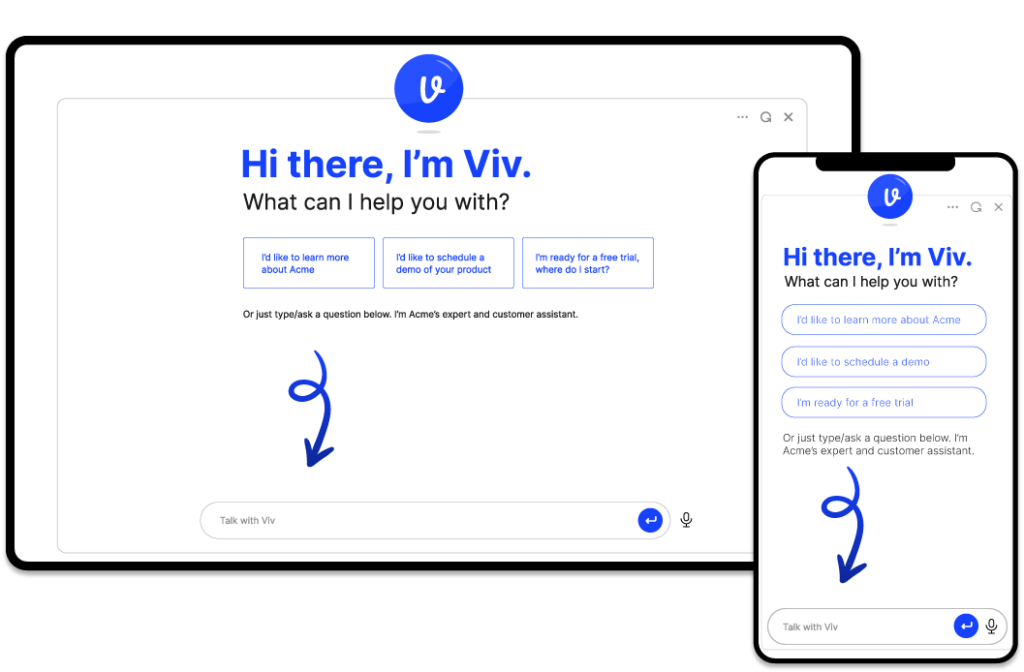
The goal for the mascot design is to create something that is: smart, helpful, and positive. Easy right? However, it also has to blend well with ANY brand and website and feel “human” without deceiving the user that it is an AI. The mascot will have to be an element that is placed inside the Chat UI (in varying sizes) and email communications.

First round of sketching/illustrations
Some of the symbolic elements I tried were the AI Spark symbol, speech bubble, and brain. However, none of them had a human element that I felt was required.

Second round of sketching/illustrations
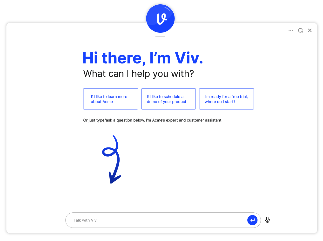
Then I came up with the idea of using a letter that represents the AI’s “name”. As we were going to enable companies to name their AI and customize the colors, it would be easy to programmatically associate the letter in the design with the chosen name. And since names are a big part of a human’s identity using the letter in the mascot design transfers some humanity to the mascot. I chose the name “Viv” to be the default AI name as “Viv” feels bright, positive, and helpful. To make the design unique, I created a customized typeface that is rounded and fun.

Second round of mascot design

High Fidelity Design
To add some vibrance and polish, I chose a deep blue color for a default palette and added a glossy finish. Companies can select to use their own color instead of the blue and a contrasting color for the letter. I added a shadow under the mascot to give it some depth and provide an opportunity for movement.

Second round of mascot design

Mascot Animation

With the goal of increasing user engagement we decided to explore animating the mascot to add more personality. I thought it would be an interesting experiment to have the mascot “act” like a human would in a face to face conversation.

Initial Mascot Movements/Reactions
The initial movements I selected to try were: waiting (bobbing motion), excited (wagging), and understanding/nodding (quick bounce). I also decided it would be fun if the mascot could react to being “poked” with a mouse pointer or finger with a squeeze and a burp of bubbles.

Waiting

Excited

Understanding/Nodding

Chat UI Design

The direction from the leadership team was to create a Chat UI that felt more engaging and fun that chatting with a chatbot or even a live customer service rep. In addition, the UI must be “theme-able” so that companies could customize the UI with their own colors and fonts. My design approach uses the customer’s brand colors in the key components: the mascot, buttons, links, and in the supporting graphics. I created a compelling welcome message using stylized text, buttons and graphics to make it as easy as possible for Users to quickly get answers to their most common questions.

AI Chat UI

Chat Motion Design

How might we entice Users to chat with our AI?

With Users feeling fatigued with legacy “dumb” chat UX that starts in the bottom right corner of the website, we wondered how we could provide a different entry point. One of the theories we tested was to create a Search Box Launcher. The Search Box is a familiar component that allows Users to specify a question/prompt with the expectation of receiving an answer. In this case, the answer would come in the form of a Chat UI. I created the animation below as a proof of concept and for the software developers to use as a guide in their development.

How can we provide a more immersive experience when sharing content?

We wanted to test our hypothesis that allowing Users to feel that the chat was more of a “shared board” experience, would make them feel more engaged with the AI. To test this, I animated our Chat UI to shift into a Shared Board UI when the AI was sharing media with the User as part of the conversation.

What We Learned

The data showed that users engaged 3x more often with the Search Box Launcher than the traditional chat icon if the placement was on a secondary page like Pricing, FAQs, and Blog Articles. On the home page, we did not see the same trend. In interviews, Users expressed that, while on the home page, they had not yet formed questions that they felt they could not find the answer to on their own, but, by the time they navigated to a secondary page where they were seeking specific information, they were ready to ask questions when the information wasn’t obvious or available.

In addition, User’s expressed delight at the the Shared Board UI experience and suggested that we find additional ways to incorporate media and graphics into the chat experience as long as it was helpful.